CSS Media Queries you don't know
CSS media queries were introduced as part of CSS3. They allow for you to change your CSS based upon the device or device's characteristics. You are likely already using these to adjust the look of your page based on the width of your screen. However, they have multiple other functionalities that are often overlooked.
A typical media query looks like:
@media screen and (min-width: 1200px){
  ...
}
However, you can do much more than checking if the css will be displayed on a screen of 1200px or more.
You can also see if the page is being printed
@media print{
  // removing background-color and images for print friendlyness
}
You can also check orientation of the viewport
@media (orientation: landscape){
  // Great for changing how your site looks on a phone
}
You can check if the device allows for you to hover
@media hover{
  // change hover features to a click feature.
}
You can even check whether the device has an input mechanism that can hover
@media (any-hover: hover){
  // Display hover CSS only to devices that have a device that can hover connected to it.
}

@media (any-hover: none){
  // The same as above but none
}
Another great media query for phone support would be any-pointer that lets you tell if a device has a pointer and how fine the pointer is.
@media (any-pointer: fine){
  // Make the button small
}

@media (any-pointer: coarse){
  // Make the button larger, likely on a cell phone
}
As the web matures we've found that the web should cater to all users. Media queries are a great way to do that. Here are some additional ways you can improve your user experience.
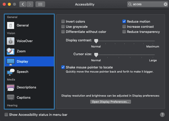
Users who are sensitive to motion can disable it on their computer.

@media(prefers-reduced-motion: reduce){
  // remove distracting animations
}
And finally, you can even see if JavaScript is enabled
@media(scripting: none){
  // display content that would otherwise be hidden behind a JavaScript show/hide.
}
As you can see, there are lots of great media queries you probably didn't know existed. Hopefully you'll be able to use these on your next project.